UI / UX Design
SpendSense
Turning financial data into clear, meaningful insights that help users make better decisions with confidence.
Year :
2026
Industry :
Fintech
Client :
Self-initiated concept project
Project Duration :
2 weeks
Problem :
Many personal finance apps prioritise detailed transaction data over clarity, making it difficult for users to understand their spending behaviour.
Through initial research, I found that users often feel overwhelmed or anxious when engaging with financial tools, leading to avoidance rather than informed decision-making. This highlighted a gap for tools that support not just tracking, but understanding.
Research :
I conducted interviews with 5 users aged 24–35 who regularly use digital banking apps.
Key insights included:
4/5 users avoided checking their finances unless necessary
Users struggled to identify spending patterns without manually reviewing transactions
Financial apps were described as “informative but stressful”
A review of existing tools such as Revolut showed a strong focus on tracking and categorisation, with less emphasis on helping users interpret their behaviour.
Solution :
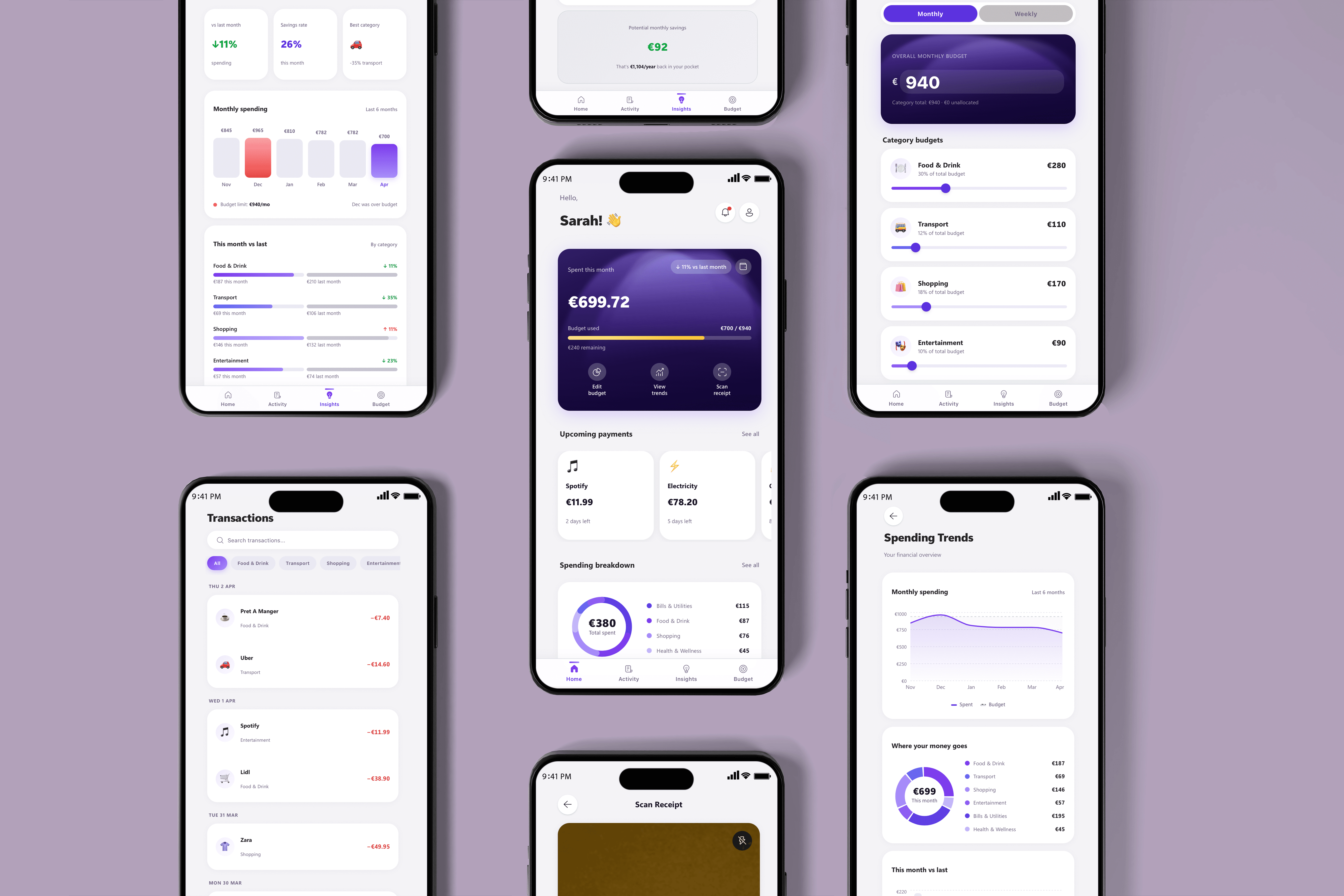
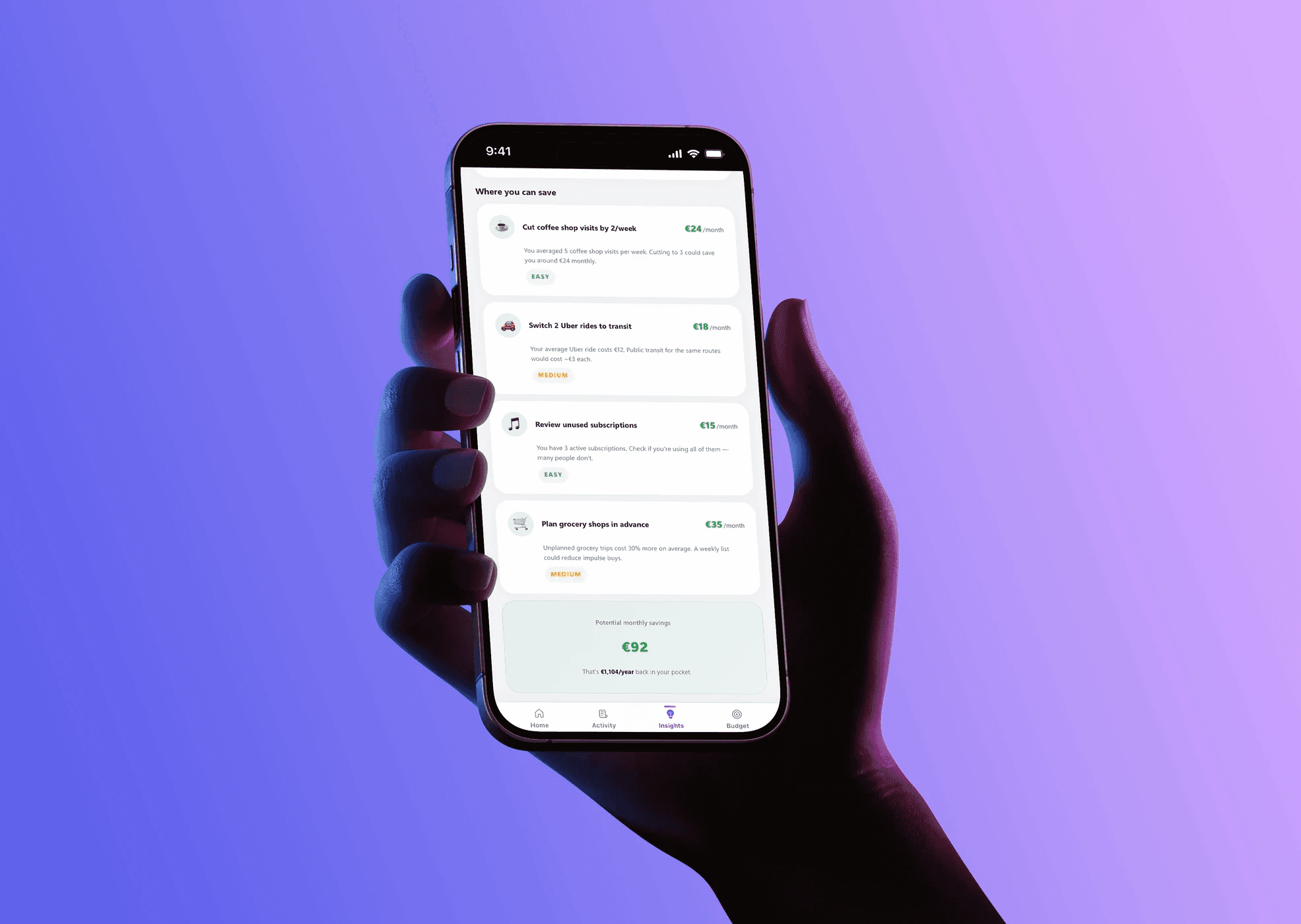
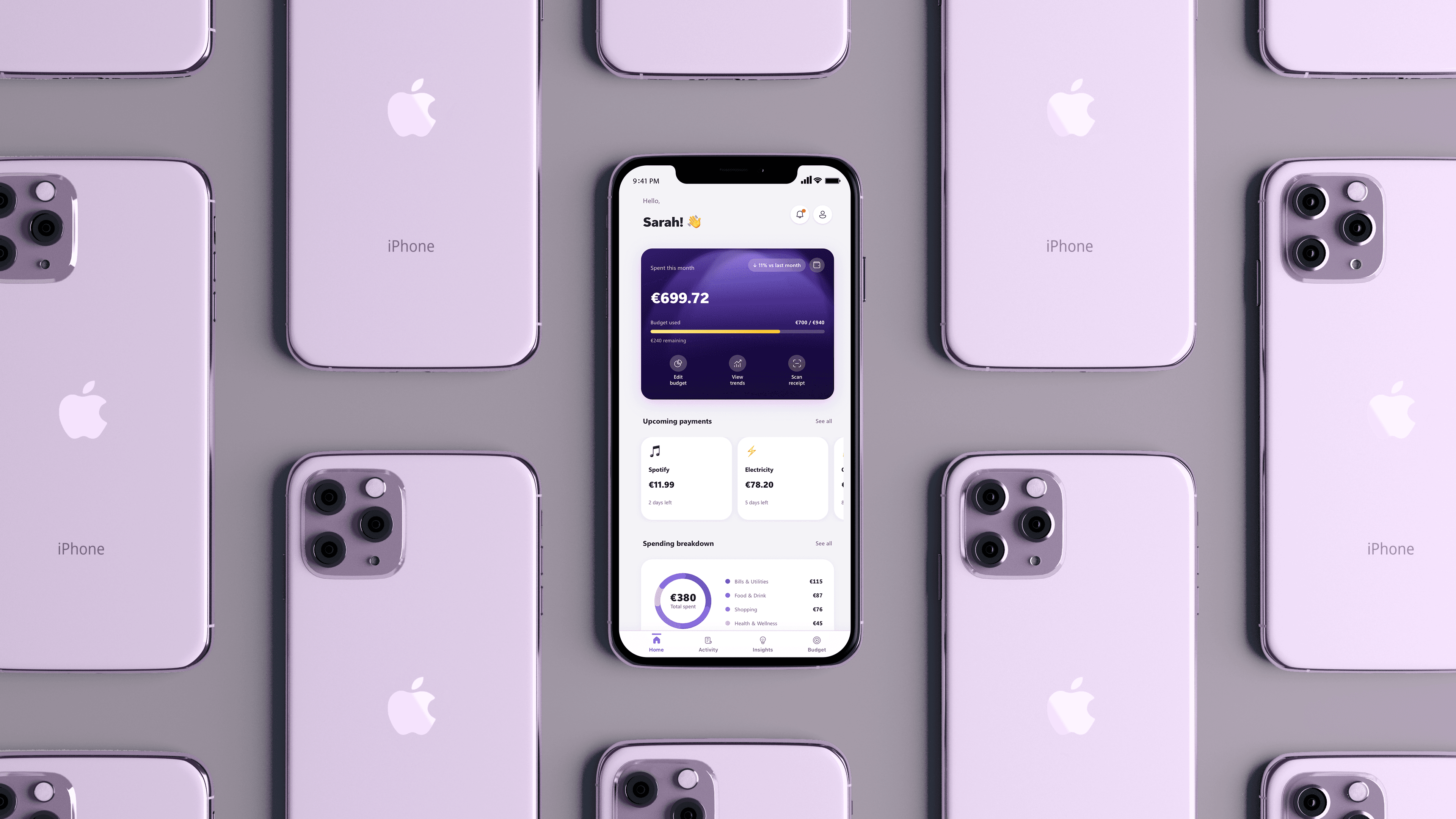
I designed a mobile app that shifts the focus from raw data to behavioural insights.
Key features include:
A simplified dashboard highlighting spending patterns rather than transactions
Contextual insights (e.g. “This week you overspent on Wednesday.”)
Visual summaries designed to reduce cognitive load
The goal was to help users quickly understand why they spend, not just what they spend.
Challenge :
A key challenge was simplifying complex financial data without removing useful detail.
To address this, I prioritised:
Progressive disclosure (showing high-level insights first, with detail on demand)
Clear visual hierarchy to reduce cognitive overload
A neutral, supportive tone to avoid creating guilt or anxiety
Balancing clarity with accuracy required continuous iteration and testing.

Constraints :
This project was scoped as an MVP for a small fintech startup:
2-week design timeline
Limited engineering resources
No access to live banking APIs
These constraints informed decisions around feature scope and prioritisation.
Outcome :
In usability testing:
Users were able to explain their spending patterns more quickly compared to traditional apps
4/5 participants reported feeling less overwhelmed when reviewing their finances
This suggests that simplifying financial data into behavioural insights can improve both understanding and engagement.

More Projects


Award Winner
Read
UI / UX Design
SpendSense
Turning financial data into clear, meaningful insights that help users make better decisions with confidence.
Year :
2026
Industry :
Fintech
Client :
Self-initiated concept project
Project Duration :
2 weeks
Problem :
Many personal finance apps prioritise detailed transaction data over clarity, making it difficult for users to understand their spending behaviour.
Through initial research, I found that users often feel overwhelmed or anxious when engaging with financial tools, leading to avoidance rather than informed decision-making. This highlighted a gap for tools that support not just tracking, but understanding.
Research :
I conducted interviews with 5 users aged 24–35 who regularly use digital banking apps.
Key insights included:
4/5 users avoided checking their finances unless necessary
Users struggled to identify spending patterns without manually reviewing transactions
Financial apps were described as “informative but stressful”
A review of existing tools such as Revolut showed a strong focus on tracking and categorisation, with less emphasis on helping users interpret their behaviour.
Solution :
I designed a mobile app that shifts the focus from raw data to behavioural insights.
Key features include:
A simplified dashboard highlighting spending patterns rather than transactions
Contextual insights (e.g. “This week you overspent on Wednesday.”)
Visual summaries designed to reduce cognitive load
The goal was to help users quickly understand why they spend, not just what they spend.
Challenge :
A key challenge was simplifying complex financial data without removing useful detail.
To address this, I prioritised:
Progressive disclosure (showing high-level insights first, with detail on demand)
Clear visual hierarchy to reduce cognitive overload
A neutral, supportive tone to avoid creating guilt or anxiety
Balancing clarity with accuracy required continuous iteration and testing.
Constraints :
This project was scoped as an MVP for a small fintech startup:
2-week design timeline
Limited engineering resources
No access to live banking APIs
These constraints informed decisions around feature scope and prioritisation.
Outcome :
In usability testing:
Users were able to explain their spending patterns more quickly compared to traditional apps
4/5 participants reported feeling less overwhelmed when reviewing their finances
This suggests that simplifying financial data into behavioural insights can improve both understanding and engagement.
More Projects
Award Winner
Read